I wanted to see if there was an association between the volume of trade between a country and Sweden, and the number of exchange students that have come to Lund Univesity from there, this semester.
Author
Jonathan Jayes
Published
February 20, 2021
Purpose
In a presentation last week organized by the Laboratory for the Economics of Africa’s Past I learned about the persistence of economic connectivity between areas from the Roman era until today. It was fascinating. The presenter, Prof. Erik Hornung, mentioned offhand that the choice of where to spend a semester exchange was likely a function of the economic and social connections between your home country and your host country – whether you know someone there, have family, or are familiar due to cultural similarities.
I am in Sweden this semester, on an exchange at Lund University, in the South of the country. This is due in part to my supervisor’s connections with the economic historians here.
I wanted to see if I could back up this assertion about exchange students with some data. More specifically, I wanted to see if there was an association between the volume of trade between a country and Sweden, and the number of exchange students that have come to Lund from there, this semester.
As you see in the graphic below, there appears to be a strong positive correlation between Swedish imports of goods and imports of exchange students at Lund.
df_plotly <-read_rds("data/Sweden_trade_exchange/plotly_data.rds")c <- df_plotly %>%ggplot(aes(trade_value, exchange_students)) +geom_point(aes(size = pop_est, colour = Continent)) +geom_smooth(group =1, method ="lm", se = F) +geom_text_repel(aes(trade_value, exchange_students, label = name), alpha = .7, cex =3) +scale_y_log10() +scale_x_log10(labels =dollar_format(), limits =c(100000,NA)) +scale_size_continuous(labels = scales::comma_format()) +scale_color_brewer(palette ="Paired") +geom_hline(yintercept =0, lty =2) +labs(title ="Correlation between Sweden's imports of goods and exchange students",x ="Value of imports into Sweden in 2018 (USD)",y ="Number of exchange students in Lund Uni Whatsapp group",size ="Population")c
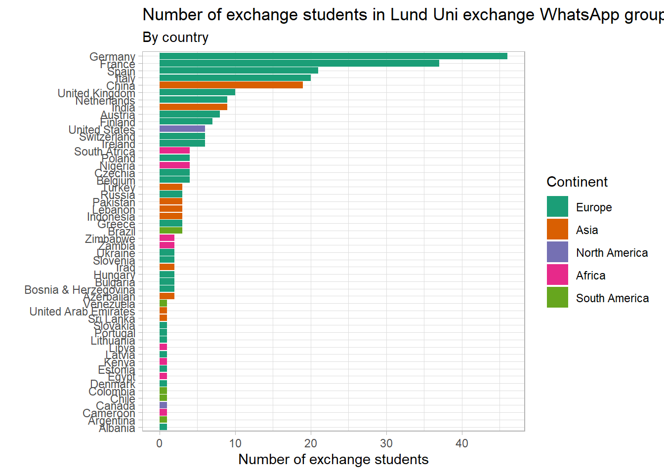
The most populous European nations of Germany and France lead the rankings, with 46 and 37 exchange students respectively. The largest non-European senders are China and India, followed by the United States. South Africa has the largest representation for Africa, with 4 students.
Read on to see the creation of the graphic.
Data
To answer my question, I link two pieces of data: trade statistics on Sweden’s imports, and the nationalities of the incoming exchange students at Lund.
Trade data
The first I downloaded from an amazing trade tool called the Observatory of Economic Complexity (Linked here). It has wonderful visualizations of trade by type of goods and by country. Have a look at this tree map below for an example.
Tree Map
The tree map shows the origins of Sweden’s imports by value in 2018. Sweden cares about limiting carbon emissions, and so it makes sense that the majority of their imports are sourced within Europe.
Data on exchange students
The second data source is a rough proxy for the nationalities of my colleagues. I collected phone numbers from a big WhatsApp group called “Lund University ’21” and extract the international dialing codes. There are several shortcomings to this data source – self-selection into WhatsApp use may differ by country, as might the desire to be part of a large group. Further, WhatsApp groups are limited in size at 256 members, just more than half the total number of exchange students at Lund this semester. My sample is unlikely to perfectly represent my population of interest, but it is a good enough starting point.
Data processing
In the chunks of code below I scrape a list of international dialing codes from the web, along with other country level information including GDP per capita and land area.
# website with data on dialing codesurl <-"https://countrycode.org/"# scrape table with rvesttable <-read_html(url) %>%html_nodes("table") %>%html_table()# processingtable <- table[[1]] %>%as_tibble(.name_repair ="minimal") %>%unnest()table <- table %>%as_tibble() %>% janitor::clean_names()# cleaning names and formatting columns as numbers rather than characterstable_df <- table %>%mutate(population =parse_number(population),area_km2 =parse_number(area_km2),gdp_usd =parse_number(gdp_usd),gdp_usd = gdp_usd*10e9)
We can show the regions of the world by the first digit of their dialing code in a neat map. Expand the chunk by clicking code to see how easy it is to make an interactive graphic with ggplotly.
# packages for map plotting and matching countries.p_load(rnaturalearth, countrycode)# extracting first digit of dialing codetable_df <- table_df %>%mutate(iso_a3 =countrycode(country, origin ="country.name", destination ="iso3c")) %>%mutate(first_digit =substring(country_code, 1, 1))# creating dataframe with mapping geometryworld <-ne_countries(scale ="medium", returnclass ="sf")# joining up to table of dialing codesmap_df <- world %>%as_tibble() %>%left_join(table_df, by ="iso_a3")# creating plota <- map_df %>%filter(!is.na(first_digit)) %>%ggplot(aes(geometry = geometry, fill = first_digit)) +geom_sf() +scale_fill_brewer(palette ="Set3") +labs(title ="Countries coloured by first digit of international dialing code",fill ="First digit")# display interactive plotggplotly(a)
Dialing codes
The trickiest part was matching a country name with an international dialing code from the number alone. I used Google’s open source library for parsing, formatting, and validating international phone numbers. It is written in Java but someone has kindly written a wrapper for R. I show the process in the code chunk below, but do not display the phone numbers themselves for privacy reasons.
# Sys.setenv(JAVA_HOME='C:\\Program Files\\Java\\jre1.8.0_281')# install.packages("dialrjars", INSTALL_opts = c("--no-multiarch"))library(dialrjars)library(dialr)df <-read_excel("data/Sweden_trade_exchange/Whatsapp numbers.xlsx")# uniform formatting of numbersdf <- df %>%mutate(clean =ifelse(str_detect(raw, "\\+.*"), raw, str_c("+", raw))) %>%select(number = clean)df <- df %>%mutate(phone =phone(number, "SE"))# get the region from numberdf <- df %>%mutate(region =get_region(phone))# count number of phone numbers per countrycounts <- df %>%count(region, sort = T)# match name of country to two letter country codecounts <- counts %>%mutate(name =countrycode(region, origin ="iso2c", destination ="country.name"),iso_a3 =countrycode(region, origin ="iso2c", destination ="iso3c"))datatable(counts)
A quick plot of counts. Wow! Look at that. Go Germany!
df_col <- counts %>%left_join(world %>%as_tibble(), by ="iso_a3") %>%rename(name = name.x)df_col %>%filter(name !="Sweden") %>%mutate(name =fct_reorder(name, n),continent =factor(continent, levels =c("Europe", "Asia", "North America", "Africa", "South America"))) %>%ggplot(aes(n, name, fill = continent)) +geom_col() +scale_fill_brewer(palette ="Dark2") +labs(title ="Number of exchange students in Lund Uni exchange WhatsApp group",subtitle ="By country",y ="",x ="Number of exchange students",fill ="Continent")
Findings
Plotting the correlation between imports of goods to Sweden and exchange students to Lund
I plot the correlation between the value of Sweden’s imports in 2018 on the x-axis, and the number of exchange students on the y-axis. Both axes are on a log scale.
Below is an interactive version of the static plot above.
c <- df_plotly %>%ggplot(aes(trade_value, exchange_students)) +geom_point(aes(size = pop_est, colour = Continent, text=paste("Country:", name))) +geom_smooth(group =1, method ="lm", se = T) +scale_y_log10() +scale_x_log10(labels =dollar_format(), limits =c(100000,NA)) +scale_size_continuous(labels = scales::comma_format()) +scale_color_brewer(palette ="Paired") +geom_hline(yintercept =0, lty =2) +labs(x ="Value of imports into Sweden in 2018 (USD)",y ="Number of exchange students in Lund Uni Whatsapp group",size ="",colour ="")ggplotly(c)