Electricity generation per capita
A post on electricity generation per capita across the world since 2000.
Introduction
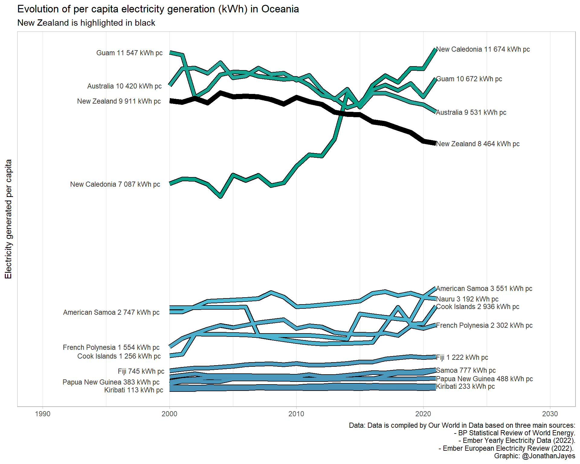
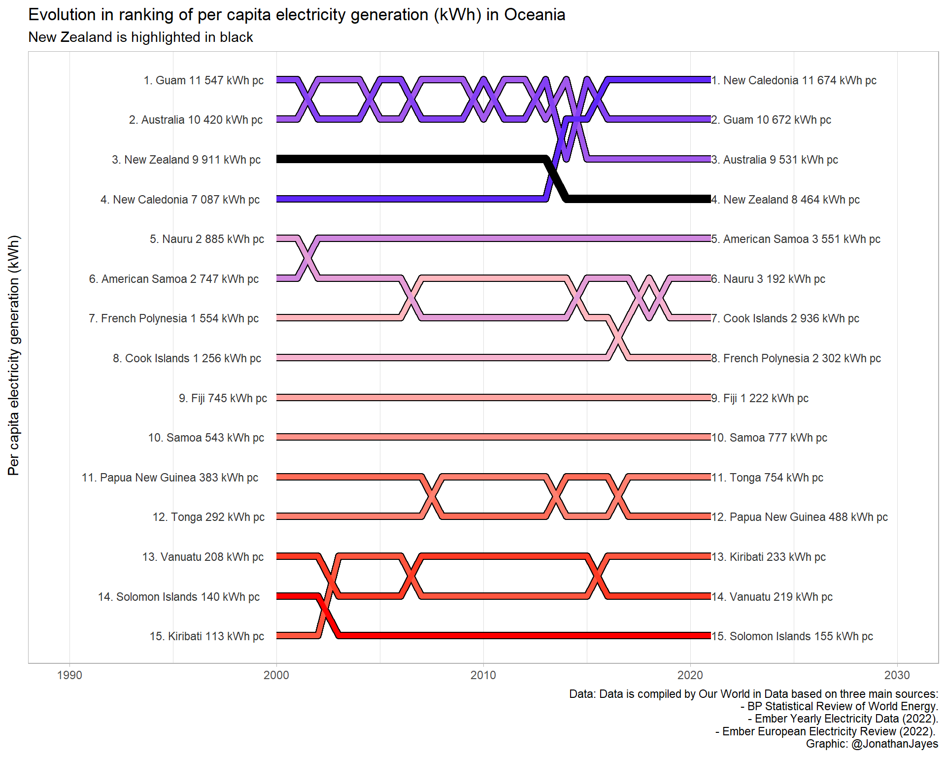
🔥In this blog post, we will take a closer look at the evolution of electricity generation per capita across the world and examine how China has rapidly climbed above its neighbors in per capita terms📈. Through the use of data visualization📊, we will explore the decrease of electricity generation per capita in New Zealand over the past few decades and compare it to other countries in the region🌎. This analysis will provide a deeper understanding of the world’s energy landscape and the global energy market🌡️. So, let’s dive in and see how energy consumption has evolved over time!🔍
Inspiration
🚀 I am inspired by the company Electricity Maps based in Copenhagen, who allow you to understand the electricity grid through data. They collect data from all around the world and compute the data in an hourly resolution, allowing you to gain granular insights accounting for the variance of the grid.💡 While we won’t use their data in this blog post, we will take a look at some great annual statistics compiled by the team at Our World in Data. This organization is dedicated to providing data-driven insights on global issues and their data on electricity generation per capita is a valuable resource for understanding how different countries are progressing in terms of energy production.📊
Visualization
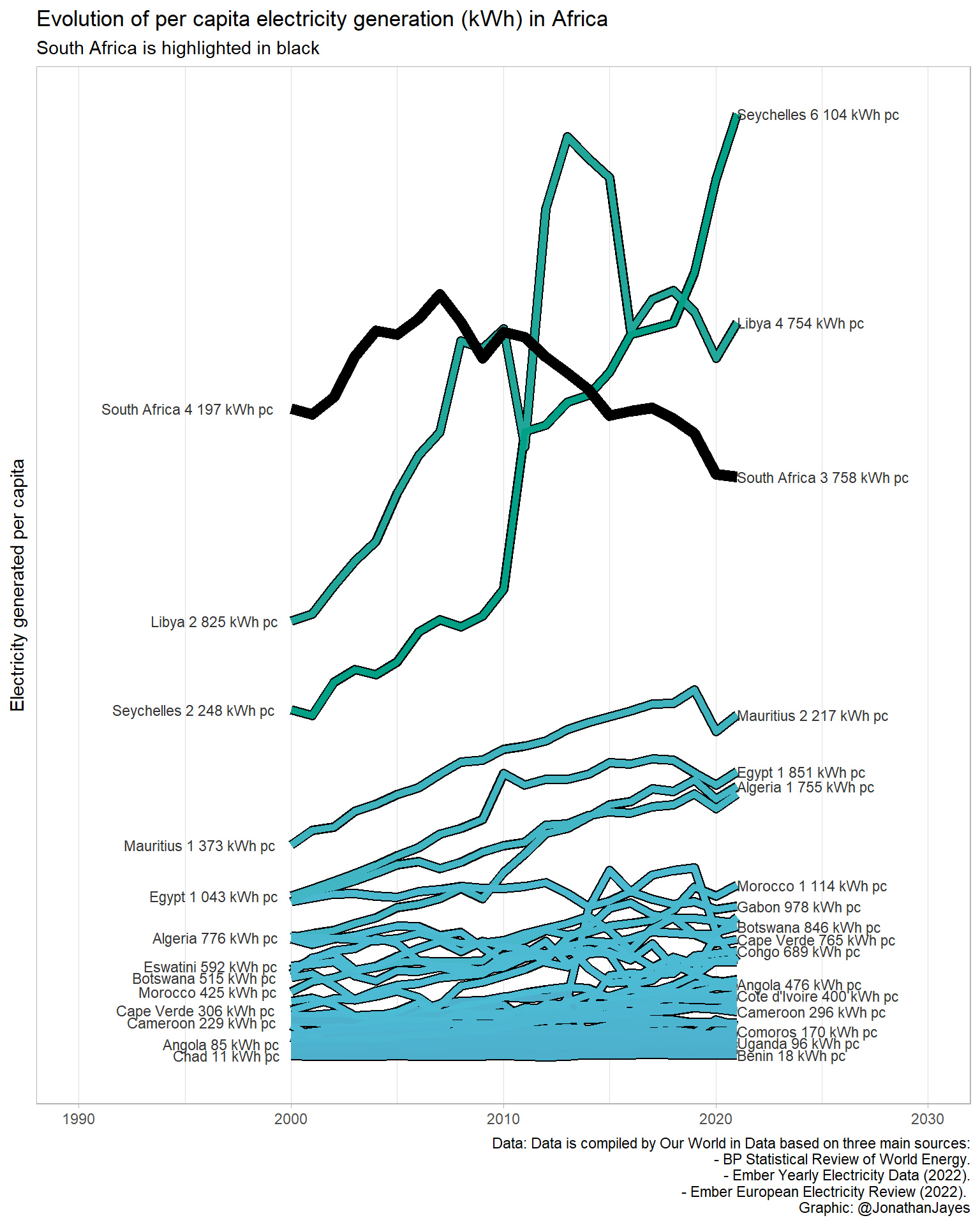
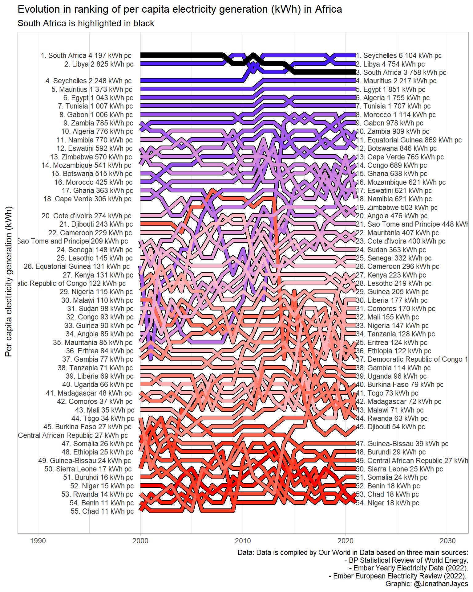
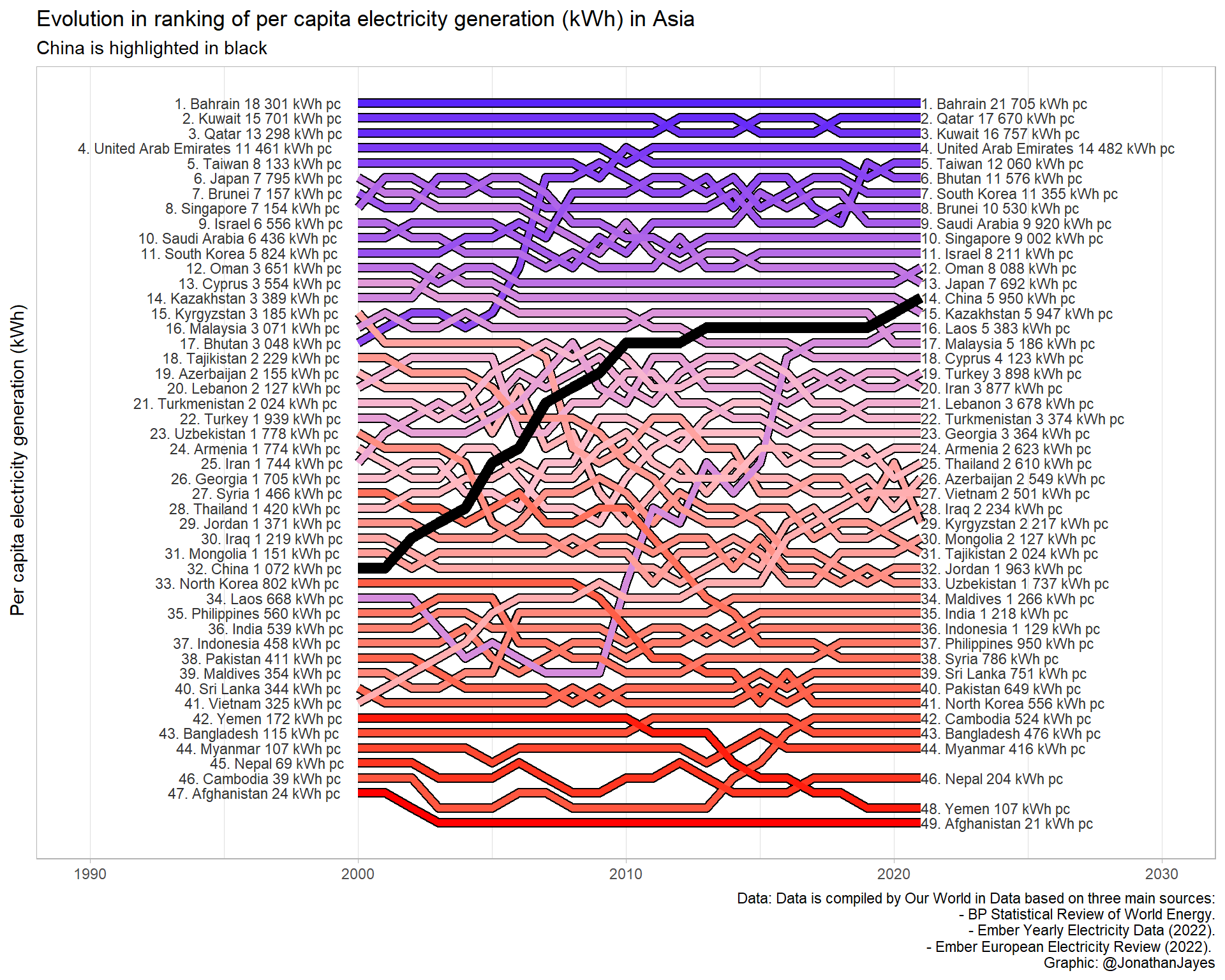
Now we can see that South Africa has climbed the rankings from 18th place in 2000 up to 7th in 2020. Interesting!
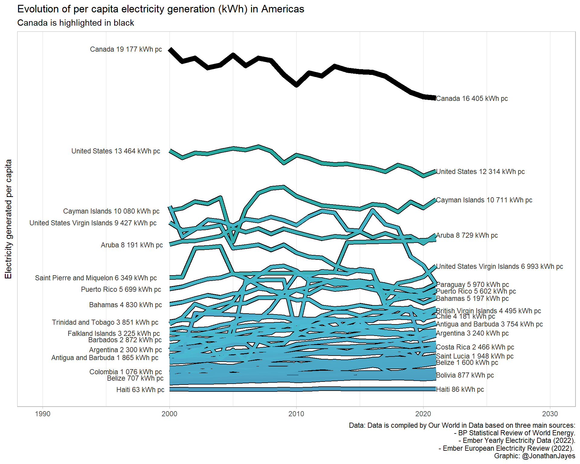
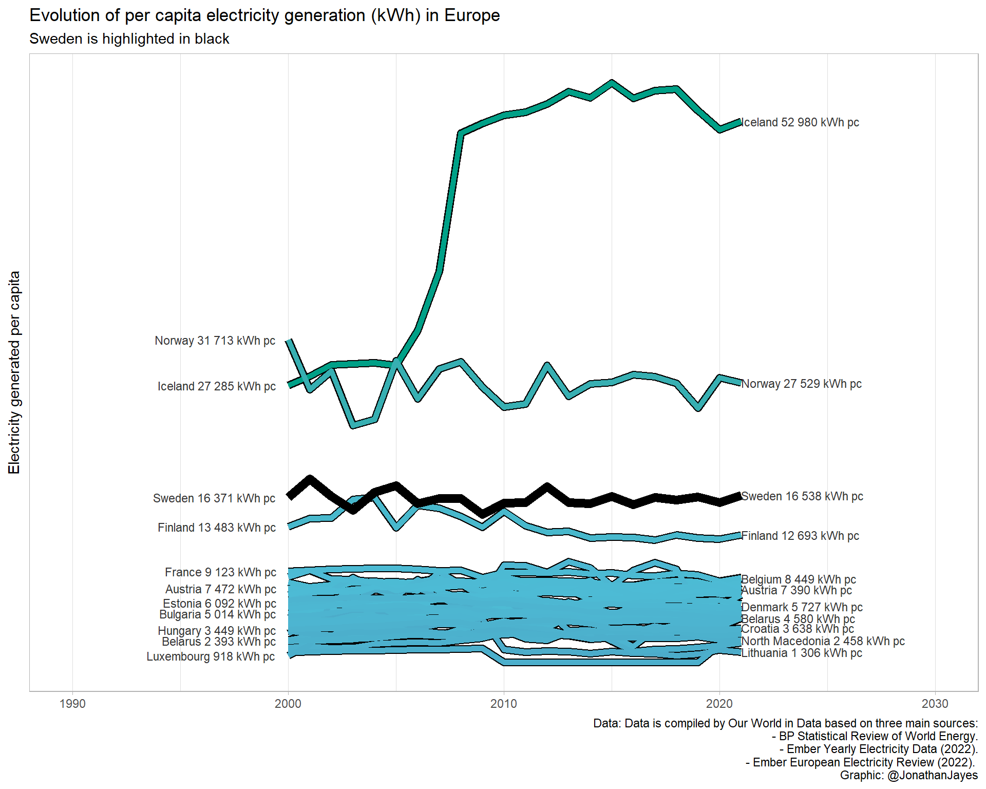
What about the other continents?
Have a look at each below, and then give my Shiny app a gander (TODO).